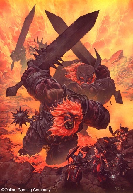
This is just me poking some fun at Ultimate Combat. Recently in a Shackled City game which my friend Tom is running, my barbarian King was killed by a trap. Part of the actual problem was the bonuses when raged and when using a two handed weapon. My math skills were not putting all of the bonuses to their highest numbers.
Eeek!
So after King died and our NPC expert trapfinder died, one of my friends who is a maestro of making characters crafted for me a ninja. But no trapfinding skills. Still, it did inspire me to flip through Ultimate Combat myself.
Personally I think Wayne Reynolds is one of the better artists we have in the industry but this cover is terrible.
The samurai on the right facing his enemies, the yeti or what have you on the left semi-facing their enemies and the core fighter thinks that this is an episode of You Think You Can Dance just standing there in the middle of the page making the action too dense and adding nothing of value to it. Who is he looking at? His blades aren't in position to actual strike anything. Worse still, he has the flailing arms thing going on.
We all appreciated Wayne making Orcus have short stubby arms. I mean sure he was the demon prince of the undead but not only was he in the first 4e Monster Manual and therefore a punk, he also had short fat arms.
Fire giants also have this horrible genetic curse. Terrible. It's why their always so pissed off. Imagine never being able to wipe your backside with your stubby little arms? Anger management isn't going to do the trick.
Seriously man. Wayne needs to take one of those little sticky pads, write no backwards flailing arms on it, and then move on.
I also challenge Paizo, if you ever reprint Ultimate Combat, take the fighter out of the center of the picture. You'll have a stronger illustration with a moment of tense potential conflict instead of some moron busting his movies in between two warring forces.
Subscribe to:
Post Comments (Atom)


No comments:
Post a Comment