Dungeon Crawl Classics gets a lot of 'play' from the old Internets. It's already gone through a printing and two special edition covers. While offered a PDF for review purposes, I opted to wait until there was a sale as my reviewing patterns, thanks to my old job consisting of working seven days a week an an ill mother have converted to a new job that I'm still learning and a still as yet ill mother.
But a sale? I figured that it probably wasn't going to get any less expensive than the GM's Day Sale. Ah, then I can just poke around when I want to and not have to worry about it. One of the things I did first was 'page' through the PDF.
Let me say that art is highly subjective. Some are going to love one specific type of artist over another, one specific type of style over another, and so on. Overall, the whole book feels like a 'retro' effort with some emphasis placed on modern design. I say some mind you.
In terms of art, the company wasn't afraid to use full page spreads which to me, is a good thing. The bad thing is that in going to 'capture' that old school feeling, it's all internally black and white. Not necessarily a bad thing but this isn't an inexpensive book. On the third hand, for a PDF, I wouldn't want a full color book. It's so armature when companies put out these PDF's that are saturated with color and would look great as a professionally printed book, but as a PDF take forever to open, flip between pages and even thinking about printing it makes you shudder and lose 1d6 SAN. If only there were a way to include multiple types of files so that you could have one for printing and one for on screen reading... hopefully one day... one day...
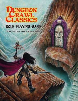
Anyway, I like the cover. It's a simple piece in that it's the lone adventurer getting ready to enter the unknown. Good use of color. The similarity between the cape and outline of the door makes some nice symmetry.
The first interior full color piece is also like a trip on acid but a pretty one. Full out dungeon crawl madness there brothers!The gods, one from law, chaos, and neutrality, waiting in the upper left hand corner as a group passes through some strange dungeon with massive worms devouring and attacking the party. Great stuff. I had to point out to one of my friends the neutral deity had a tentacle coming from his mouth. He thought maybe it represented something from the sea, while I was thinking of the Twain's mentors and the weird things they often had hidden under their cloaked hoods.
When it comes to those full page pieces, Mullen does several I enjoyed right off the bat. His style is of the 'old school' vibe. For example, there is a picture of a dragon that appears to be possessed by a demon burning a group of adventurers not with his fiery breath, but with fire shooting forth from his hand even as some strange type of winged minions wait for orders while a fighter type is commanding more soldiers into the fray.
Another great Mullen piece is a wizard among his patrons, or what I assume is a wizard among his patrons, those who grant him his dark powers. It's a great piece as all these strange and alien things of anathema wait on the cloaked stranger's words.
Another nice nodd to the old school bits are the various joke comics. Some feel that newer editions of Dungeons and Dragons take themselves too seriously. I can see it but I'm not quite so sure every book needs a Bigby's Back Scratcher bit in it. Here it works well because it's part of the genre they're trying to capture so when you see such jokes, they work.
Some bits though? Well, on one page talking about languages, you have this dark picture on top taking up about a quarter of the page and it's an intense looking situation but then on the bottom right hand corner you have a clear line illustration of some dude that looks like he's be the morning page delivering the news before getting a tomato in the face. It's distracting and cuts into the flow of the text even thought it's not a bad picture, it just doesn't 'jive' with the rest of the page in my opinion.
Another example is the table with the cleric information. We get a break down of the cleric names from first through fifth level, one for law, chaos, and neutral, and another one of these clear lined illustrations. It's already in a box separate from the rest of the text. There's already a table there. Would too much white space be a problem? Possibly. Maybe some more cleric names as opposed to random cleric?
But hey, speaking of old school art, one of the artists is Jim Holloway, a real old school artist whose works range all over the industry but include TSR. Jim does some great stuff here but, and this is going to sound weird, his art isn't necessarily 'old school' outside of it being well, original old school. If you compare him and Mullen for example, completely different styles and while both solid, I'd still say Mullen's is far more old school to my eye. Mind you for me it's not an issue but I can see someone whose knowledge of OSR is from forums wondering what's up with all the different styles of art.
Lastly, when discussing nods to old art, ranging from style and you know, actual artists of the time, there are also several homage images to the original book and its a nice nod to the AD&D you might have played once upon a time.
Now I just need to start reading the book eh?
And that's another impressive thing. There is a lot of art here. While I think the book could actually use some purging and removal of art to make it a cleaner looking book, especially on the old PDF side, if you don't like one particular style of art, there should be more than enough variety to keep you going through the book.


No comments:
Post a Comment